How would you feel if Stephen Hawking himself comes and enlightens you on black holes and quantum gravity?
Or Elon Musk spreads his knowledge on things he did wrong while working on Tesla?
The world looks better from the expert’s eye. We figured if you ever would want to learn about design concepts, you would want nothing but the best. So, we brought our designer’s best and worst experiences to get nothing but facts to you. Here is the deal, you hear a lot about Neumorphism these days, but you need an expert’s opinion to understand how this designing trend can help you.
This article is your go-to guide for Neumorphism coming to you by the best designer in town. So what are we waiting for?
Here is the highlight of the content ahead:
- What is Neumorphism?
- Origin of Neumorphism.
- The story you need.
- Neumorphing your ideas.
- A take on Neumorphic design.
- The Dos of Neumorphism.
- The Don’ts of Neumorphism.
- Is Neumorphism just a phase?
What is Neumorphism?
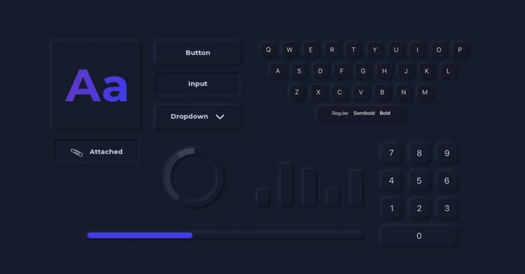
Neumorphism, as known in the tech world, is a brand new visual style that combines background colors, shapes, gradients, highlights, shadows, etc., to ensure graphic intense buttons and switches. It allows designers to achieve a soft extruded plastic look giving it an almost 3d styling.
It is considered a soft User Interface, a modern iteration of a style for designing web elements, screens, frames, etc.
Neumorphism combines developments of flat design and the old Skeuomorphism.
This way, the neumorphic cards, buttons and the progress bars have a dark box-shadow below and a light box-shadow above, creating the look and feel that the user interface components are being pushed through the display itself.
“It is also worth noting that this neumorphism is not a replacement for the old flat design style that prevailed but an addition to app user interface design.”
Meaning and Origin of the Word ‘Neumorphism’-
Neumorphism is also considered a new slang term in the IT/design circles. It essentially crosses the words ‘New’ and the old ‘Skeuomorphism’. Essentially it’s a new, minimal way to design with a soft, extruded plastic look. Giving it a look as if the interface itself has been vacuum formed.
Neumorphism is the block’s latest tech design that has turned something old into something modern and fresh. Yes, ladies and gentlemen, the old Skeuomorphism is back in a new form.
Apple has bent heavily towards Skeuomorphism for about two decades.
Back then, the words such as “Corinthian leather” and “rich baize” described the textures of materials used by the designers to create multiple apps.
The Story Behind Neumorphism :
The story begins with Skeuomorphism in the late 1980s. Steve Jobs gave one of its earliest avid proponents.
The idea was that the skeuomorphic interface design would provide users with a much better intuitive experience by mimicking physical world graphical objects as shadows, shapes, details to a very hyperreal degree.
Skeuomorphism also engaged auditory/visual cues to capture users’ attention and show them how things work. It had its usage in the first iOS versions until the 2000s.
The style, unfortunately, came to a pretty abrupt end when the design community rejected it as being a bit too literal, over the top and a bit too harsh— now we designers are considered fickle beasts.
In 2007, Forbes had stated that Skeuomorphism is dead like a past life design. This statement was then accepted as the truth six years later after iOS had redesigned with style in 2013.
The flat design was born out of its ashes, which was immediately considered polarizing because of the extreme reversal that Skeuomorphism stood for. Designers favored flattening and simplifying every UI element to the most basic shapes ever since Apple had settled on flat design.
Flat design and material design have been dominant in interface design so far, offering minimalism, convenience, personalization for users.
The Start of Neumorphism (Normal vs Neumorphic)
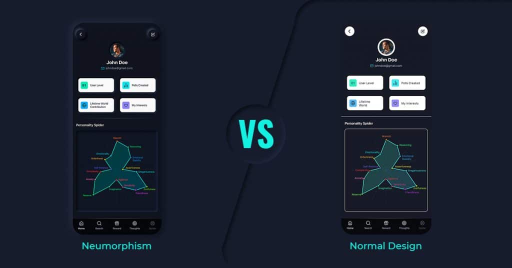
Now as to say that the Skeuomorphism as a design never entirely went away.
But, as the new super-flat, super-2D type of style took over, once again, the designers started to question the fact that we might have gone too far out the other way.
The Rise of neumorphism as the hottest UI trend changed the ‘super flat and minimal’ vector to something midway to realism.
Neumorphism mimics many real-life objects. It brings clean interfaces to life by adding a physical element to a flat User Interface paradigm.
Although neumorphism is considered the successor of the old Skeuomorphism, in actuality, it’s a child of both Skeuomorphism and the flat design, with a proper mix of genes from both of its parents.
Neumorphism embraces the idea of realism. Buttons are supposed to look like buttons, and UI elements should operate within the realms of physics. It believes that nothing is flat or floats above a surface, as flat design suggests. With this, you create a sharp style, give a fresh feel, and represent the modern take of technology.
A Take on Design
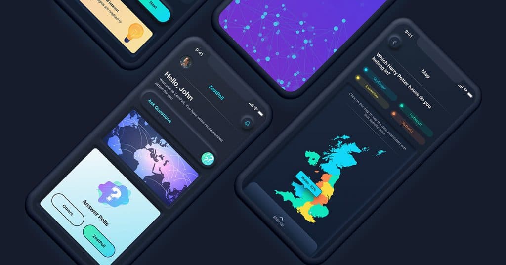
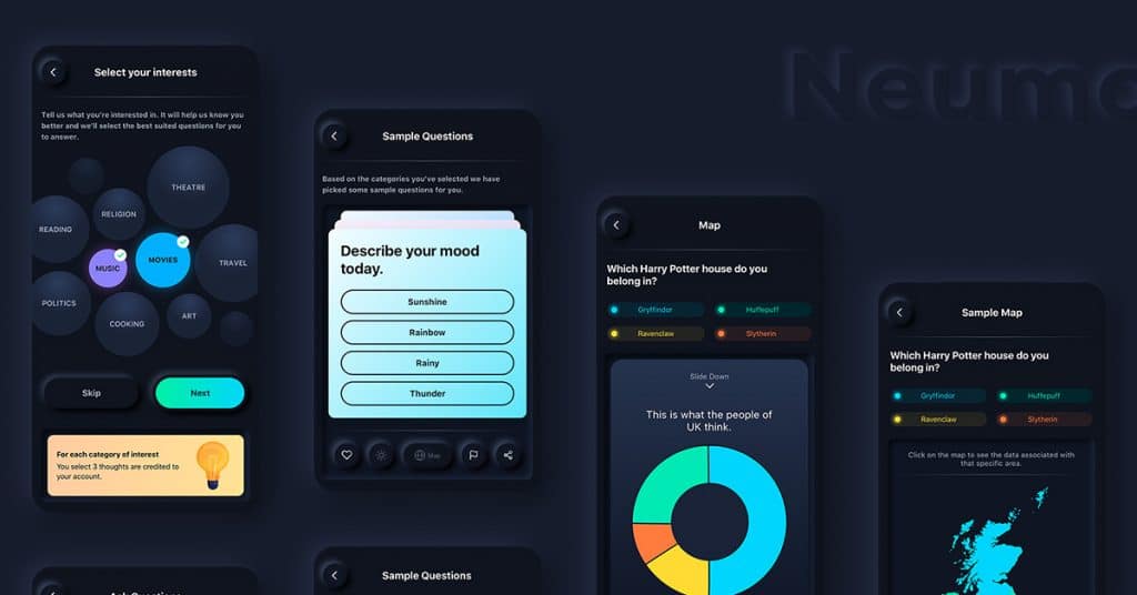
To give you a real time reference, here’s a sample project purely based on Neumorphism that I recently worked on:
https://www.behance.net/gallery/125937909/Neumorphism-App-Design
Coming to neumorphic designs, nobody knows for sure.
Given the subtlety of the shadowing, using one or the other would create a design devoid of depth, therefore dispelling the illusion.
This new subtlety, focusing on tints of black and white, gives it an altogether more modern feel. It’s not about recreating the natural world in digital space. Instead, it’s about designing a digital UI that looks functional in the real world.
A minor drawback can be considered as given to the complete lack of contrasts and as such for conditions like ‘Colour Blindness’ could make dealing with the style hard going.
Some Advantages of Modern Neumorphism (The Dos)
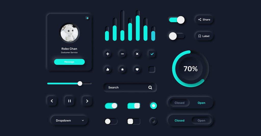
- It adds 3d feels for actual buttons, which you can reach out and press.
- All of that is achieved by a visual representation with the icons.
- This is also the most significant advantage of Neumorphism as it is highly suitable for interfaces with small buttons that can mimic real-life objects.
- The freshness of this modern design seems to be the only scoring point for now.
- With neuromorphic design on the screens, tactile design can reach a whole new level.
- While people with visibility issues will find it easier to distinguish between elements on the screen, those with sound visibility will enjoy interaction with products with an almost realistic look.
Cons/Drawbacks of The Neumorphic Design (The Don’ts)
Unfortunately, Neumorphism loses about two points here.
1. Accessibility issues-
Since the entire design style uses lights and shadows, it does not contain a proper contrast ratio. This is a big no-no in the accessibility part.
Technically, it’s a game of two different shadows — a dark one and a light one. Now, if you try to increase the contrast through these shadows, the design might lose its essence and look somewhat loud and a bit ugly.
2. Spacing issue-
Since every element uses two shadows, the overall space used therefore is more than its flat counterpart. This will also make it challenging to implement this style when several elements are arranged on a screen.
Neumorphism, as one of the biggest trends in UI, brings a breath of fresh air to app user interface design, looks soft and is easy on the eyes; therefore, people seem to like it. Yet, there are some recurring issues regarding accessibility/visibility, particularly about buttons. Some problems may arise with lower screen brightness/contrast, causing problems for people with visibility issues and people in general.
Also, some issues have been occurring regarding efficiently coding components and customizing buttons and input styles based on the concept of neumorphism.
Is Neumorphism Just a Phase?
As a designer looking at the past feedback, it’s not necessarily just a phase. The concept can be merged with modern Material design. This way, both neumorphism and modern Material can co-exist happily.
What Else Can You Do With Neumorphism?
Neumorphism can be used to improve the design quality and use of UI specifically for people with visual disabilities.
Tanvas, a pioneer of multi touch haptic technology, has recently worked on a tactile design that would let a user feel the interface. As incredible as it sounds, the design might work wonders for visually impaired people. This design can reach a whole new level making it easier for visually impaired people to distinguish the on-screen elements. So, you know, magic can be created with Neumorphism.