“Design adds value faster than it adds costs.”
-Joel Spolsky, Creator of Trello
The design of any product is something you have to pay for only once. It is a part of the fixed cost that you have already projected for your product. But, every unit sold adds excellent value, not just to that particular product but the whole brand.
The same goes for a mobile app UI design. It is the first impression of a mobile application that connects a user with the brand. When a mobile app UI is interactive, user-centric, and has engaging content, nothing can stop it from becoming successful.
But an app’s UI design has limits beyond its looks. Therefore, one needs to combine some specific UI design guidelines with an app’s architecture to attain a successful mobile app. This article will reveal all those secrets you should know about mobile application UI design to make your app engaging for users.
What is Mobile App UI Design?
A mobile app UI is everything a user spots and interacts with while using a mobile application. However, a mobile app UI design is responsible for how your app looks. But why is it so important? I will tell you why but before that, let me ask you a question. What is the first thing you see in a mobile app? Its specifications, functions? No, the most probable answer is its interface, and to explain it, let’s see an example.
Imagine you are travelling in a cab or your vehicle. Suddenly, a branded sports car with a stunning look stops beside you. What would be your first thought after seeing that breathtaking beauty standing near you? Well, at that time, you won’t think about the strength or durability of the car. In fact, it can be possible that you might not consider its features and functions. Instead, the foremost thing that will come into your mind is how incredible its design is and how appealing it is to your eyes.
The same thing happens with mobile applications. Before anything, the first thing that might attract a user to a mobile application is its UI design. The more impressive, clear and problem-solving an app UI design is, the greater is the user experience (UX). Therefore, to enhance UX for your mobile app, its UI design will be the foundational step.
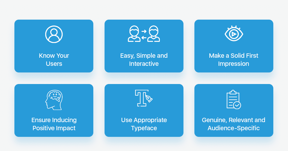
Now, it might be clear why the UI design of a mobile app is so crucial. So, let’s proceed with learning the eight must-know principles related to mobile user interface design and layout.
Eight UI design principles to enhance the UX of your mobile app
Know your target audience
The first thing that you should take care of is your target audience and what they like. It does not mean that you should know each and everyone’s personal choices (and that’s not even practically possible), but learning about those common elements that everyone wants in a mobile app design. It simply means understanding all the demographic data your analytics department can pull and knowing what your users actually need.

For this, your mobile app should have the capability to connect with your users through an interactive UI. It helps you in staying updated with the likes and dislikes of your target audience. In addition, UI designers should stay tuned to the latest trends in designs to make your app more appealing. For instance, one of the recent trends in UI design is Neumorphism. It is a modified term for new skeuomorphism. You might be confused reading all these complex terms, aren’t you? So let’s understand them more clearly.
Neumorphism makes a difference!
Skeuomorphism is a concept used to describe the UI objects that imitate their real-world counterparts in their appearance and how a user can interact with them. A well-known example is an icon resembling the recycle bin. Its appearance is like a trash can where you can dump or delete files like dumping garbage. Neumorphism uses the same concept of real-life imagery but with a twisted touch of improved 3-D graphical styling. It provides flat buttons and icons with an eye-popping multi-dimensional makeover.
However, there is a problem with it. If your mobile app targets middle or older-aged individuals, then Neumorphism might not be a perfect mobile app UI design element. The reason being, older people usually prefer interfaces that are plain and simple to interact with. The 3-D icons and design can be appealing to the young generation, but for the elderly age groups, it might appear to be a little complex. That’s why you should always know about your target audience and their expectations from an application. Then, make sure your app design connects with them on an emotional level.
(Pro Tip: Along with knowing your target audience, you should also keep in mind the platform for which you are creating the design of your mobile app. For example, for both Android and iOS applications, you will need separate tools, strategies and layout patterns that might not be the same all the time for both platforms.)
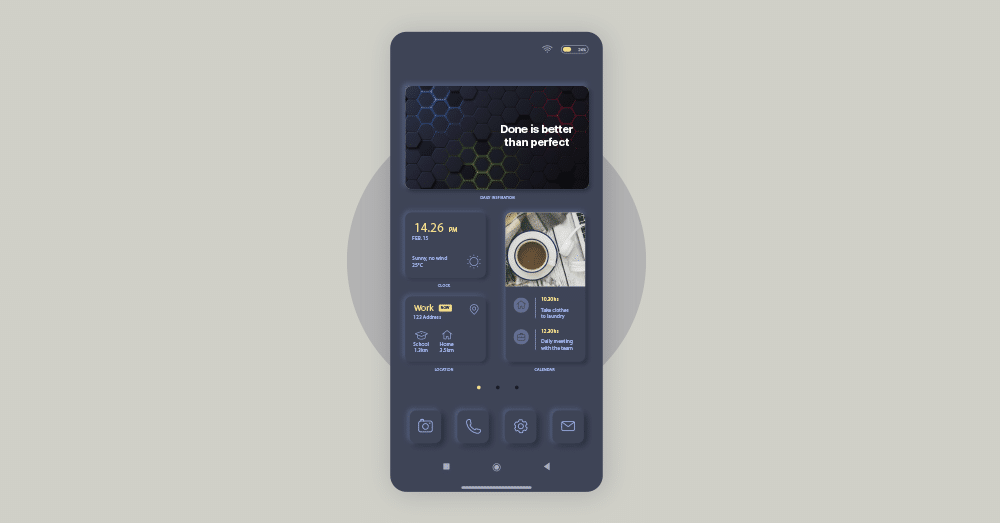
Consistency in design layout
Consistency is the key to success. The same applies to mobile app design too. You should maintain consistency in the overall design layout in your mobile application to prevent glitches that may happen while the application is running. When the design layout is inconsistent, it can be challenging for the users to access the app on different devices. Therefore, you should ensure that all the sections of your application unfold smoothly, offering a seamless experience to your users. For example, an icon in a mobile app representing a specific category should not represent a different category when accessed on another platform or device.

But why is UI design consistency important?
- Inconsistency in design layout makes your users confused, and this confusion can lead to frustration. You don’t want to make your users feel frustrated, right?
- When there is a fixed and consistent design, you can use the predefined components to build it frequently. Moreover, it reduces the time and efforts of the designers that they can use in the incremental improvement of the application.
However, it does not mean that there is no scope for innovation in such cases. You can always redesign your mobile app UI as per the requirements and changing trends. But make sure that the design is delivering the same content and information universally.
Netflix, Dropbox and Evernote are some of the applications that provide consistency in mobile app UI design. Remember, inconsistent UI design can confuse the users, leading to a bad user experience.
Implementing a proper navigation design
A navigation design helps the users to navigate things on an application or website. Navigation plays a crucial role in determining how your user will interact and get from one point to another within your mobile application. Good navigation helps maintain the flow between the screens to reach the part of your app they are looking for. Proper navigation will help in:
- Enhancing the user’s understanding of the app
- Improving the user satisfaction level
- Providing credibility to your product and services
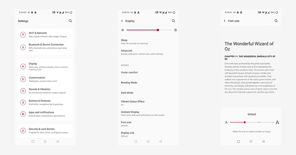
When your application UI design is serving proper navigation, it promotes easy accessibility and usability. For example, in your mobile settings, you can change the font size of the text by navigating the display settings. Whether your application has a drop-down menu, breadcrumb menu, or simple tabs, make sure it follows a user flow so that your users can navigate quickly to achieve their goals.
Master the art of storytelling
You might have heard about the power of storytelling when it comes to content. But in the digital era, design is also an integral part of content. In fact, for a mobile application, a design presents your content and information in a specific manner. That’s the reason virtual storytelling for app UI design becomes significant and supersedes siloed (isolated or non-interacting) designs. Virtual storytelling involves graphics and AI elements that help your users interact with your mobile app like they are a part of it. It is an attention-seeking approach that will let your application get more engagements and better UX.
Below are some of the handy tools and techniques you can use to master the art of storytelling:
- Colour Palettes: The choices of colours form one of the most crucial parts of a visual design. Perfect colour combos bring elements to life and emphasize correct takeaways, such as Call-To-Actions (CTAs).
- Wireframes: A wireframe represents the key screens and interface elements of a UI design. It acts as the middle ground between the low-fidelity sketches and prototype of an app design and identifies the UI/UX issues early.
- Visual Hierarchy: It has a direct impact on the overall user experience. Make sure you place your UI elements correctly so that users can easily absorb the general intention and message you want to convey.
- Audience-specific Designing: As already mentioned, you should know your users and develop a UI design that is relevant, authentic and audience-oriented. Your users will engage more with your mobile application to relate and connect with its design content.
Make it simple but significant!
Well, yes, this quote from Don Draper does apply to designing too. You can’t imagine what wonders simplicity can do. Complexities do not only frustrate the people in real life but can irritate them in the virtual world too. It would be surprising for you to know that around 29% of people immediately abandon a mobile application if they don’t find any value in it. Therefore, it becomes crucial for a business to develop an application that is simple yet interactive enough to generate value. But how? Following a minimalistic design can help.
The word minimalistic design comes from Minimalism, an art movement that started post-WWII according to some beliefs. In layman language, it is a simple, clear and concise app UI design that brings the designing capabilities to its core. Its relation is not entirely with an app’s performance or functionality. However, it focuses on implementing the essential designing elements that take your app to the success zone. Below are some of the ways to achieve a simple, minimalistic design for your mobile application:
- Choose a limited and sophisticated colour scheme:
Some UI designers think that using various colours can provide an appealing look to a mobile application. However, this is not true. Using too many colours can reduce the sophisticated level of your application and make it unpleasant to the users. Therefore, limiting the colours to be used in your application can make it elegant and easily understandable for the audience. Two popular colour schemes available for the designers are Monochromatic and Analogous.
- Choose one typeface for one app:
A typeface is a. design of text like letters, numbers, punctuations, etc. Many designers prefer to use many font sizes or styles for their mobile app UI design, but it can make their app look oddly weird. You need to focus on your typographic skills and enhance your interface design by managing the style, size or weight and avoiding using different typefaces.
- Divide by elements, not lines:
Designers often use lines and dividers to distinguish the different categories and sections of their mobile application screen. However, like many colours, too many lines can make your app design look clumsy and untidy. To overcome this issue, you can use blocks and spacing colours to segregate the different sections of the content. In fact, if you still want to use lines and separators, use them in a definite ratio and amount to make your mobile app UI design look appealing and attractive to your users. The interface design of Google Calendar is one such example.
- Blur effects
Blur effects can be one of the best ways to get a minimalistic design for your application. It is the part where you can play with layers and interface hierarchy. One of the perfect examples of apps using blur effects is the Yahoo Weather app.
Make large touch area for icons and buttons
Now, this is something that can make or break the user interaction of your mobile app. But to understand this, let’s learn about Fitt’s Law, a fundamental principle of Human-Computer Interaction (HCI), first. As per the law, ‘The time to accomplish a target is a function of the distance to and size of that target.’ In layman language regarding an app UI design, the closer or bigger an object is, the faster you can achieve it. Regarding the app icons and buttons, there are three main implications that you should take care of:
- Make buttons, icons, and other click targets big enough to be easily seen and clickable:
This is especially crucial for menus, target buttons, or other link lists, as insufficient space can lead people to repeatedly click the wrong links and buttons.
- Make a large touch area for the buttons having the most common and maximum actions larger and prominent:
You should make sure to design the control sizes that are easier to tap using the thumb (as per the Design Thumb Rule). Providing smaller control sizes can irritate the user while using your application.
- Place navigation buttons or other commonly used elements like search bars at the corners of the screen for easy reach:
It helps in separating the commonly used elements and avoid the users overshooting their click target.
Make decision making simple
Have you ever heard of Hick’s law, which states, ‘The more choices you present to your users, the more time it will take for them to make a decision? This law applies perfectly to the concept of mobile app design. When you offer your users so many options, it makes them over-analyze the choices. As a result, it creates an overwhelming solution for them that eventually makes them less likely to complete an action.
In fact, Mark Zuckerberg, Chairman and CEO of Facebook, once shared that he kept all grey t-shirts in his wardrobe. On asking for the reason, he said that he wants to clear his life to make it so that he has to make as few decisions as possible. It doesn’t mean that giving a lot of choices will always be a bad option. Sometimes, it’s good to slow down your users and make them consider their alternatives. That’s why the tiled designs in Pinterest, Dribble and many other business sites performed well.
However, wherever possible, try to minimize the clutter and keep minimum content on the screen. Users never want to see many alternatives and content that distracts them from choosing any one option. Therefore, try to keep your design simple and avoid stuffing complex design elements in your application UI design. That’s why it is recommended to put only one CTA on the landing pages and non-newsletters emails.
Anticipate mistakes to prevent errors
It is again an important part that you need to take care of. We are humans (expecting a robot is not reading this article), and we make mistakes. However, that does not mean that we always have to suffer the consequences of those mistakes. So, how to prevent ourselves from such results or lessen the impact of human errors? Well, here are two ways for that:
- Prevent mistakes before committing them. (Though it is pretty impractical as in most cases, people don’t want to make a mistake intentionally, it just happens.)
- Provide people who committed an error (or can make one) with the ways to fix them. Well, that’s possible, right?
Since due to an information overload, a user might be distracted by tons of information presented through an app UI design while accessing a website or an application. Consequently, the chances of making an error become even higher. The reasons for this is that:
- People do not always pay attention to the screen and do not read or see everything carefully mentioned. (Inattentiveness or Carelessness)
- People usually make mistakes while clicking an option or entering information while typing. (Typing errors)
Therefore, the burden falls on the shoulders of a UI designer to prevent the users from committing such mistakes. And that’s when detailed error message design plays its role. For the designers, it becomes essential to state an error message in a way that:
- Explains the problem. For example, “You forgot to enter the username of your account. How will we know it’s you?”
- Explains the way to fix it. For example, “Please don’t forget to enter your username to access your account.”
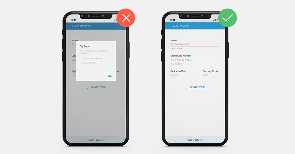
Mobile app design patterns with clear and relevant error prevention statements make the users double-check their work and warn them before making a mistake. This principle of anticipating mistakes is often known as the “Poka-Yoke” principle. Poka-Yoke is a Japanese term that simply means ‘mistake-proofing or accidental error prevention’.
Wrapping Up
With the constant technological upliftment and changing trends, the importance of UI/UX has become a crucial aspect that might influence your product’s success. Around 52% of users claim that they might not return to a mobile website or app due to poor aesthetics. Therefore, to provide a fantastic user experience through your app, it’s essential to have an interactive mobile app UI design. These eight UI design secrets revealed in this article can help you enhance your app’s user experience. Moreover, with an engaging app design, you can target a larger audience for the app’s appealing look.