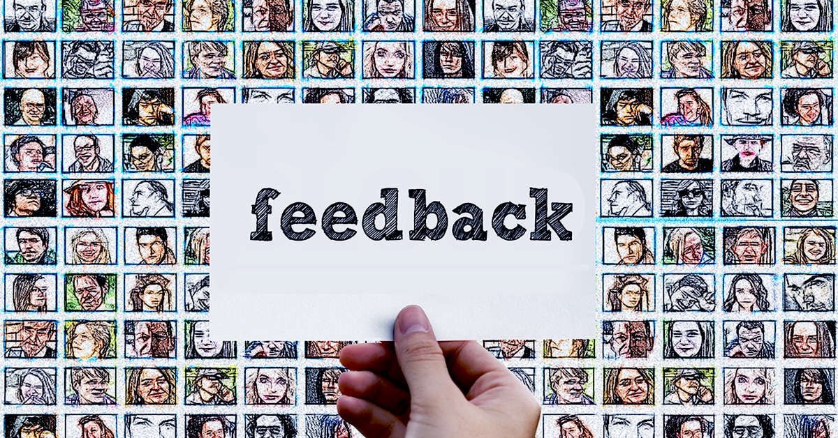
“I redesigned my app, but conversions and sales dipped big time”
If you belong to the community of product developers and designers, you may hear the above phrase once in a while.
You may hear the following as well.
“The new design was contemporary, minimalistic and highly responsive, yet the retention rate dropped.”
There are some popular instances when redesigning didn’t go well, and businesses were damaged significantly. But people keep on treading the same path without learning from their mistakes. They rely heavily on “Gut Feel”, or have a fondness for textbook stuff like “Best Practices”, or get carried away by “Trends” in the market.
Redesigning should be based on reason and logic, catering to a genuine shift in users’ perception.
Change is the only constant. The market changes, and so does users, and so does their perception. That said, you can’t change the DNA of your product. You can’t change the very fundamentals on which it’s based. Though you can play with its UI to enrich the user experience. You can redesign the platform.
If you can establish a data-driven process and define KPIs related to your design, then redesigning can fetch you increased conversions and more happy users.
But there is a flip side too. At times redesigns hit the wrong note, leading to a plummeting conversion rate and confused users. This is nothing but a magnet for negative reviews. Even the big players meet redesigning failures, the most recent being Snapchat. We will come to it later.
So why does redesigning miss the mark at times?
When you redesign a product visually or functionally, you disrupt users’ habit of using the product in a certain way. You disrupt the way they remember a product.
For instance, if you change the way users access the settings page on your app, you are disrupting a habit. Users who were seamlessly using the app will now struggle to find that page. This will make them feel challenged. It’s almost like a microaggression, which designers must avoid at all costs.
Let’s take the case of Snapchat
Prior to the redesigning, users would swipe left to view stories and swipe right to chat with friends. They would swipe left from the main camera screen to view stories of their friends. Stories that were promoted appeared alongside their friends’ stories.
Post redesigning, friends’ stories were clubbed with the chat section and promoted stories got an exclusive page. The idea was to make it easier for publishers to promote paid content, by giving them a separate space.
Needless to say, it backfired, as Snapchat’s average rating dropped from 3.1 stars to 2.4.
So what went wrong?
First of all, it hampered the habituation of users, without really adding genuine comfort. More importantly, users didn’t pay much heed to the paid stories, as now they were placed separately.
As a result, the user count dropped by 2% and Ad views went down by 36%.
Naturally, Snapchat had to roll back the changes.
Smart redesigns can work wonders though
It’s always a double edge sword when you think about redesigning. You don’t want to redesign a product to an extent that it changes the very DNA of the product. At the same time, you can’t play it safe and stick to the same design, or you will face the risk of phasing out, becoming irrelevant.
The trick is to make subtle changes that are lightweight, and if not progressive then at least bearable for users. For instance, you may bypass flashy animations or gestures, to provide simpler substitutes to users.
Let’s look at some of the successful cases of redesigning
Netflix redesigned its interface in 2011 and named it ‘Density’. The idea was to give users a denser and personalized experience.
Originally there were four titles in a row which users could see. There was a ‘Play’ button and star rating under each title’s thumbnail. There was a lot of whitespaces, which wasn’t an intelligent use of the screen, as per Netflix’s team.
The UI was redesigned into scrollable rows with title thumbnails. The ‘Play’ button and the star rating were removed from the default view, and users could hover to thumbnails. A/B testing was done for both versions, on a small set of new and existing members.
The retention in the new version jumped from 20 to 55 basis points, and engagement jumped from 30 to 140 basis points.
Another classic case is that of Wacom, that targets two mutually exclusive customer base, namely the creative professionals, and the general public interested in basic tools.
Their challenge was to create a UI that catered to both sets of users. The previous version was very cluttered, so to better distinguish product-content from company-content, they literally divided the site into two sides, for consumers and corporate. The new version of the site increased the overall traffic by 300%.
There are some lessons to be learned
1. Effective redesigns are not always about aesthetic appeal.
Redesigning just for the sake of spectacular visuals, seldom produces fruitful results. It’s important to keep upgrading and refining the design language of your site, to keep your brand value and customers intact, but blindly implementing design trends without laying due emphasis on relevancy, is bound to invite failures.
2. The Key Is To Focus On Micro Conversions
Micro conversions usually take a back seat, as focus majorly remains on the big numbers, like the number of times the app was installed, the number of users who signed up, or the sales generated.
What are Micro conversions?
They are like checkpoints in the conversion funnel, that eventually lead to the end goal or macro conversion. They are actually the low hanging fruits, and people fail to realize that. The number of users availing the search feature, or changing their profile pictures, or confirming their phone numbers, they all can come under the umbrella of micro conversions.
Ideally, micro-conversions should have their own set of goals. Tracking such goals can help you simplify the complexities in your redesigned platform, and of course the user journey.
Pertinent questions can be asked in this regard, like:
- Is there a dip in one of the micro-conversion metrics?
- Are you having difficulty to find the new search bar?
- Is the new layout or color scheme camouflaging the call-to-action?
Redesigning is a process, not a destination. That’s the bottom line.
You need to tick all the checkboxes, and with changing trends, different checkboxes will keep on adding to the process.