Have you heard of “The Princess and the Pea” story? Can you believe that something as tiny as a pea can give sleepless nights to a pretty little girl?
To be honest, it is possible.
But why did I mention this old fairy tale in a tech-blog? So that you can relate better!
Just as the small pea made no difference to anyone else but the princess, the same way really tiny elements (that you won’t even notice) can bother users who visit your website. Your website’s UI might have many little unnoticeable details that your users would like to live without.
Well, that’s not something only I claim; the famous author Vitaly Friedman introduced an entire list of such small factors that might have lost their way in the UI development of your website.
These factors can. Therefore, add-in provides your website with an overall bad user experience.

After analyzing the above pointers, I amalgamated the six most common factors contributing to users countering frustrating instances while surfing through your website.
Let’s move forward and allow me to take you right to the point!
Let’s get started!
Top 6 Concerns and Their Solutions
Small Text Can Create a Mess!

Would you like to read this?
Okay, be honest, how frustrating is reading the above line? Precisely what I was saying!
Reading small texts can be super irritating and have all the scope of giving you a proper headache (literally). Therefore, small texts are a big NO-NO!
The things you should work upon keeping this point in mind are maintaining legibility and readability of your website’s textual aspects for creating a bang-on user experience.
The Solution:
- The minimum font size of the text of an ideal website should be about 16 pixels. Even Though 16 pixels of a text body is a good start for your website, website owners should work on the motto “bigger the screen, larger the text.”
- The web designer working on your project must aim to achieve the line-height of 1.5 em or 1.6 em to support optional readability.
- The next point is a super awesome trip! Make sure to always test the website on the device it has been designed for.
Tiny Clickable Elements
This is a common issue. Once I was scrolling through an eCommerce website, and I liked a scarf; when I tried buying it via my mobile phone, the “add to cart” button was so tiny that it wouldn’t work unless I zoom it.
That was quite frustrating.
If your website’s elements are too tiny and require too much effort from a user, s/he would make the buy from somewhere else. No one likes to waste their time straining their eyes and minds.
Not all buyers are dedicated to shopping from your website only. If you keep all elements tiny, you are literally serving your users to your rivals on a shiny silver plate.
The world knows that more people access websites via their mobile phones instead of desktops. Thus your website should be readable and clickable even when accessed through a smartphone or on a smaller screen.
The Solution:
- A mouse pointer won’t really be attractive or feasible in a website when users are accessing it through a mobile phone. Therefore, make sure all your website elements are “finger-friendly” right from the start of your web app development. The desired size would be 9mmX9mm, and the touch targets should be 48X48 px.
- As per Microsoft’s guidelines, a minimum of 10mm padding must be added between the touch elements.
Too Many Pop-ups
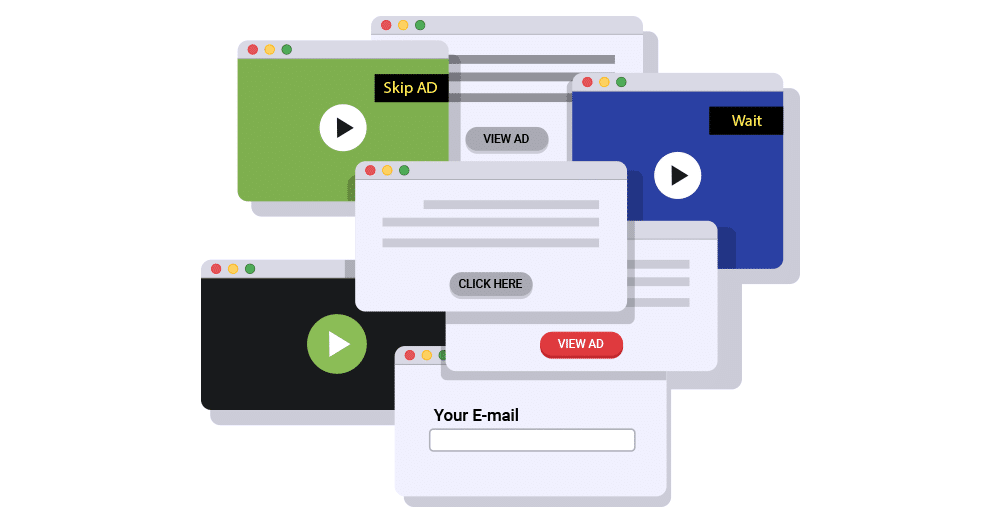
Source: Freepik.com
Imagine you land on a website, and you are trying to access some precious information you’ve been searching for days. Even though you are on the website, unnecessary pop-ups keep disturbing you, and every time you click somewhere, you end up clicking on a pop-up and getting redirected to a different page.
Even imagining it makes me irritated.
Would you want to revisit that site? Or become a subscriber?
If you guessed no, then how can you expect your users to remain loyal to you?
Take help from a professional company to develop your project so that the chances of creating an untidy and cluttered website go down to zero.
One more factor will join hands with the pop-ups and irritate your users even more, and it’s- Content Shift.
It refers to the adjustment your webpage makes upon an interaction.
For example, your user wanted to “exit” the page but ended up “buying” the product. Well, even though you have a sale, you also have an angry user who’ll get definitely bad mouth your website.
And one less sale is better than the negative publicity.
The Solution:
- Take consultation with a professional on how many pop-ups should be integrated so that they’re not irritating.
- To avoid content shifting, it would be better to measure the height of your website’s content while hardcoding it as a “min-height” in the CSS container.
The Data Gulping Form
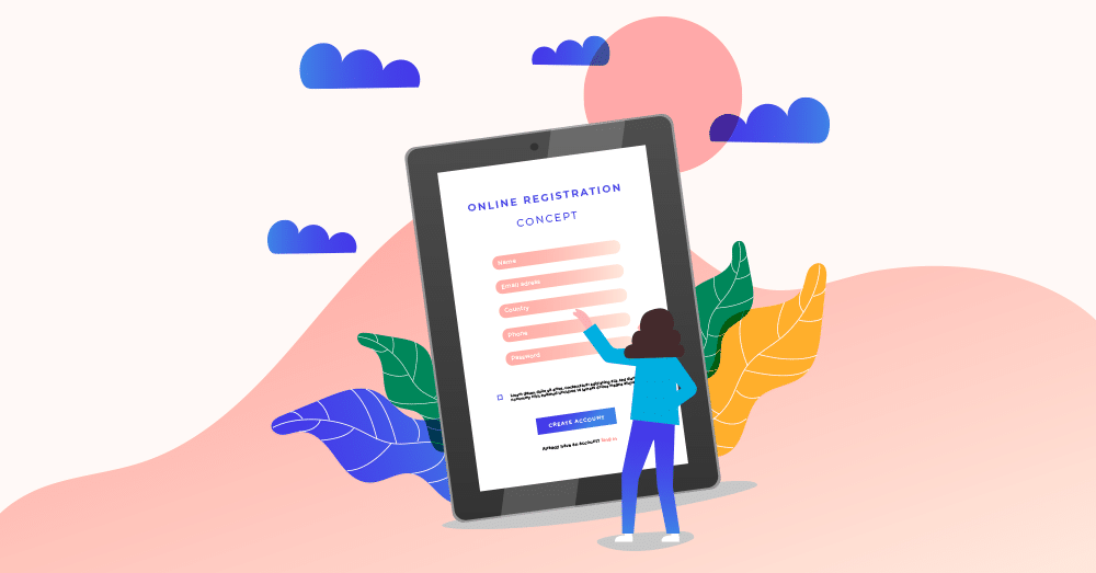
Source: Freepik.com
Many users would raise their hands if I ask them if they ever filled an entire form, and once they click on “submit,” the page reloads, and all the data is gone.
I mean, how frustrating?
You fix that issue better before your audience plan to improve their attention to your rival website.
The Solution:
- You can start by utilizing session storage and local storage for the key-value pairs.
- Make sure to pre-fill the data in their respective columns in the form. So, the user wouldn’t have to re-integrate the data after logging out. Also, ensure not to erase user data if they accidentally click on the refresh button.
Automatic Scrolling
Automatic scrolling, or scroll hijacking, is one of the most “disapproved by users” trend of UI designing. Some would disagree with me here, but most will nod their heads for yes.
Control hijacking refers to the functionality in websites that allows them to control a particular page’s scrolling.
For example, a page with some information automatically scrolls down in a specific time limit, “assuming” you are done reading the data.
However, It is believed that you should not jeopardize user expectations regarding the website scrolling interactions for the sake of a narrative experience.
Thus, automatic scrolling can hamper the overall user experience of your website.
The Solution:
- If you still plan on integrating the scroll hijacking, follow the simple rule- always use an appropriate layout.
- Try to stick to a balanced approach, and try to adjust the content in the form of individual elements or slides. This will provide the user with the feeling that the drops are switching while they scroll.
Unwanted Audio/Video Content
Another factor that can make your users abandon your website is the auto-play video and audio elements.
Have encountered a situation where you ever visited a web page, and just as the home page reloads, a video starts playing to your shock. This can be super irritating!
Imagine your phone’s or laptop’s volume is at full and that video is played super loud. Would you still be on that site? Or just click the back button to make that video stop?
It is just as annoying as the thought of it. And even if your user is very dedicated to using your website, s/he will have to make extra efforts to do that.
The Solution:
Let’s say; it is totally safe to add auto-play videos to your website, all the big companies to it. However, to avoid bothering your users, keep the audio at mute in default.
Conclusion
Knowing the do’s and don’t of web app development is crucial if you wish to successfully deliver a project and make a highly competitive market statement. While every article on the web will tell you the do’s, understanding the don’t and taking essential measures to fix them are equally important.
The above-pointed flaws may look too “general” but are the ones that are mostly “skipped” or overlooked by business owners.
You know, the obvious ones and the most important ones. Always keep that in mind!