“Good Design is Good Business”
-Thomas Watson Jr (American Businessman)
The human body is designed to interact with the world using visual cues. Our brains interact, absorb, manipulate and react to visual information in highly effective methods.
In short, humans are visual creatures. Our likeness towards images is built into our cognition and the ability to pay attention. Therefore, when we look at a text with an image, our attention is automatically drawn towards the picture.
Our brain processes images at lightning speed, literally. To be precise, the human brain recognizes a familiar object within 100 milliseconds and a familiar face within 380 milliseconds.
I guess that’s enough to understand that social network designs play an exceptionally crucial role in attracting user’s attention to your business. However, marketers who have worked on creating visuals for their company know just how tiring, time-consuming and draining it can be to get them just-right graphics.
Although going through the designing process is necessary, you can still avoid it becoming troublesome by making sure you make minimum mistakes while creating social media designs.
But before we move on with the design fundamentals and principles, let’s understand the basics.
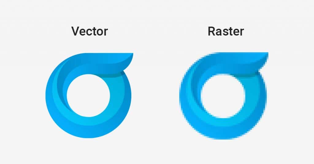
The difference between Vector and Raster
Designs revolve around two primary practices, i,e. Vector and Raster.
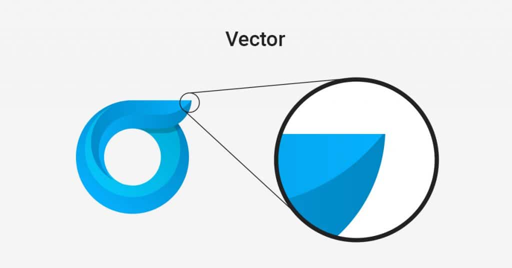
What is Vector?
Vector designing is based on a mathematical equation; it is created using lines, curves, and points instead of using specific pixels. Using a vector program requires you to outline shapes. Each of these shapes is known as an object and consists of one single colour. Once you outline all the shapes needed, you can layer them over one another to create a proper design. So resizing your image has no limits; it is on-point and precise as the computer will only use a mathematical equation to resize it.
Where to use a vector program?
- Logos and insignia
- Files for product
- Files for print
- Engineering
- Computer-aided designs
- Technical drawings
- 3D graphics
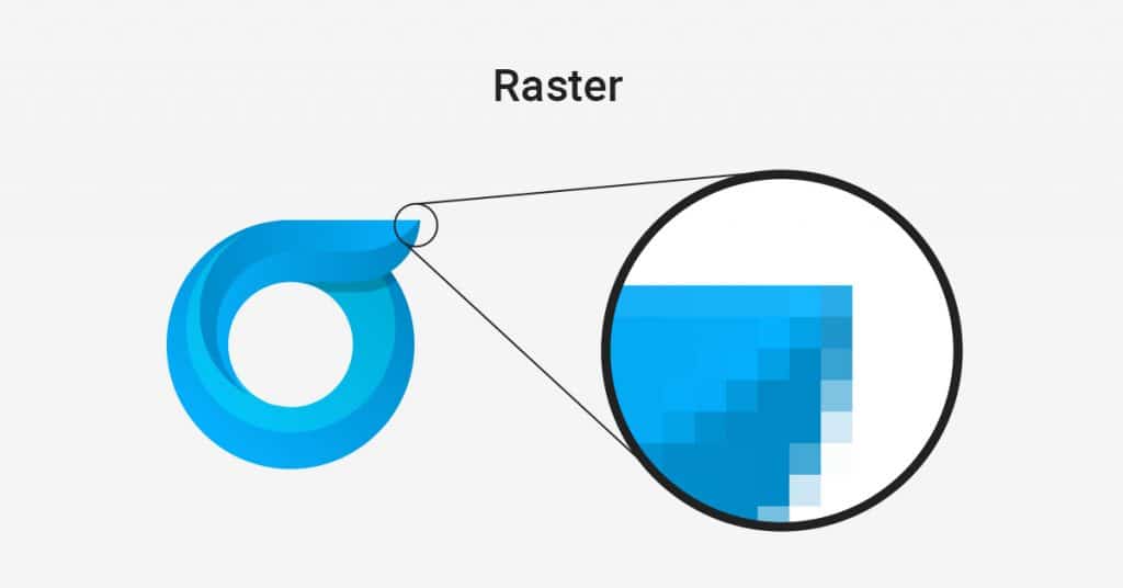
What is Raster?
Roaster images are also known as bitmaps, which are made up of many square pixels. Think of a camera or a scanner; you can use these images to paint a picture with the pixels of an image. You can soften the transition by blending colours to another; you can also use blurring effects and other ingredients or any other artistic effect.
Where to use a raster program?
- Photos
- Websites
- Digital publications
- Complex artistic effects
Now, let’s dive in to learn about 14 Design Principles and Fundamentals that’ll help you enhance your image game.
The 14 Design Principles and Fundamentals
Colour
“90% of instant judgments about products are made on the colour alone.”
Colour is the core aspect of any social media design. It sets the mood, creates your desirable atmosphere, shares emotions, and even evokes an individual’s past experiences.
As per a study conducted on the impact of colour on marketing, about 90% of products judgment are made on the colour scheme it uses. Other studies suggest it’s important to use colours that support the personality you wish to portray rather than aligning your designs with the typical colour association.
The power of colour can convey the brand’s personality, giving it visibility and specifying the target audience.
For example, a product targeted for kids aged between 5-10 years might use bright colours like green, red, yellow and pink. However, a product targeted at women of age group 30-35 might consist of colours that provoke calmness, like sea blue, beige, peach, etc.
Guide your audience through a story using your social media images. In fact, a good colour scheme can also work as an add on to your website’s user experience. Other than the “important UI design aspects, “you can not miss out on a targeted colour scheme.
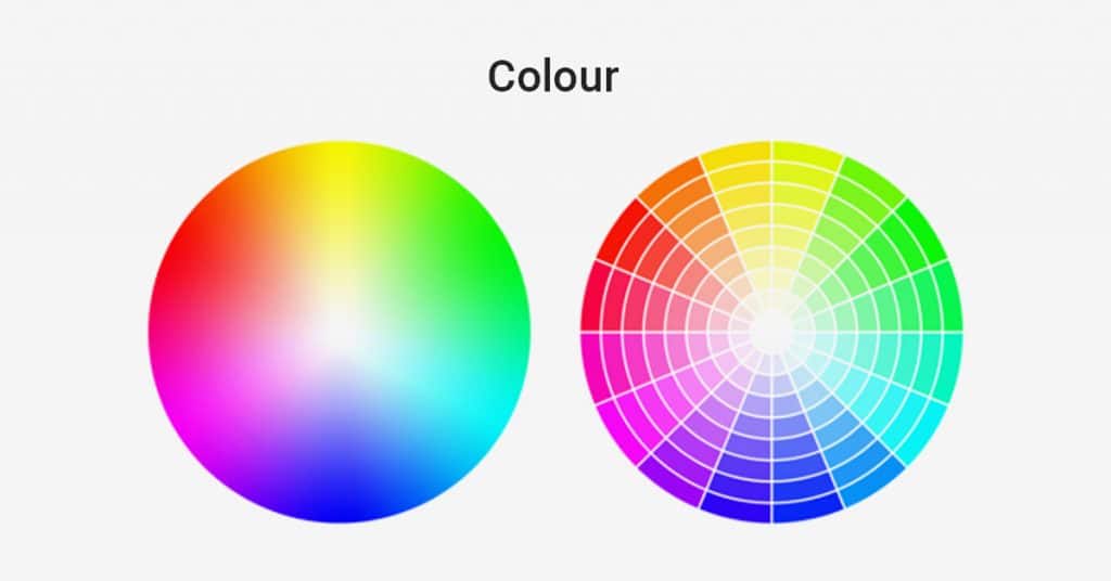
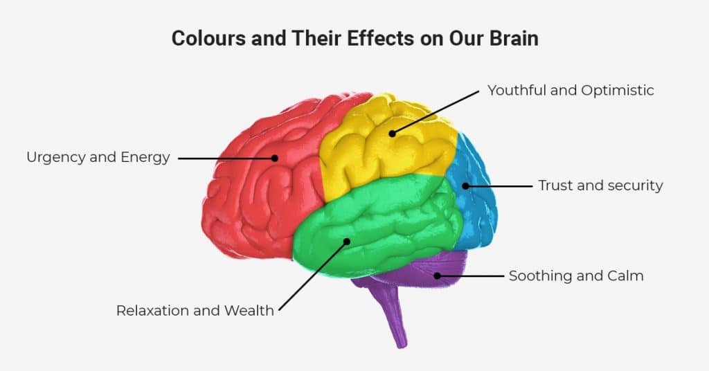
Colours and their effects on our brain:
Red – Urgency and Energy
Orange – Aggression
Green – Relaxation and Wealth
Yellow– Youthful and Optimistic
Pink – Romance and Femininity
Blue – Trust and security
Purple – Soothing and Calm
Black – Sleek and Powerful
Balance
Balance is essential in everything. You must’ve heard of the “not too much, not too little” phrase; this goes with everything, be it sugar in your coffee or patterns in your social media designs. However, getting the perfect balance in the social network designs is a tough nut to crack. An efficient way to maintain the balance of your post is to imagine each element you have consists of a particular weight, and you must not exceed the weight limit you’ve set for your post; otherwise, your weighing scale may tilt to one side.
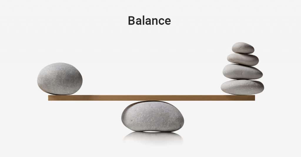
It would be best if you remembered that different elements might have different weights. Therefore the balance is not supposed to be split down to the middle.
There are four types of balances:
- Symmetrical
- Asymmetrical
- Radial
- Crystallographic
Lines
Lines are guiding paths for your images. If you want your user to pay attention to a specific element of your image, just draw a line pointing towards it. Straight lines indicate the order and give an effect of tidiness, while curved and crooked lines give the image an organized movement and tension.
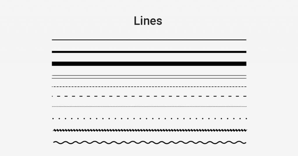
You can take your audience through a visual journey by paying close attention to the use of lines throughout your designs. You can make your audience stop at essential elements and make them move wherever you wish to.
Typography
Typography is the core of your design. What text you choose and how you choose to showcase it will primarily affect your target audience’s attention span on your post. The element has an unignorable impact on your brand message and visibility.
Typography determines how your brand communicates to its users. Each text you chose portrays emotion and has a feeling attached to it.
Different typography may appeal to different genders and ages.
When you choose “the font” for your post, keep in mind the readability. As graphic designer Paul Rand once said, “don’t try to be original, try to be good” you should, too, continue to be unique in the best possible way.
Whether you choose Times New Roman or Sans Serif, make sure your audience can clearly read your message.
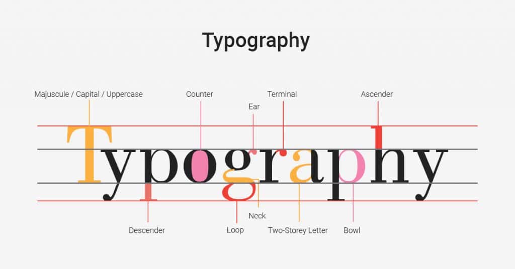
Here are a few tips you should remember while choosing your font:
- Use font sizes that fit the medium you are publishing on
- Use a maximum of 3 typefaces
- Use Leading
- Use Kerning
- Remember, Sans Serif is best for the web, and Serif goes with print.
Contrast
Have you ever seen a design that really pops?
What contributes to this majorly is the contrast of the design. A perfect contrast provides a differentiation between elements, grabbing your audience’s attention to one that “pops.”
Imagine a picture of a dense forest, everything is in green, and the rising sun is captured in the photograph perfectly. The yellow of the sun is in contrast with the dark green forest and grabs attention automatically. Thanks to the bright colour.
The use of proper contrast is the most attractive way to enhance your social media presence. You can call for attention to the elements you wish with this technique. Without an excellent contrasting technique, you put your posts through the risk of going “flat.” However, also remember, too much contrast can make your design look cluttered.
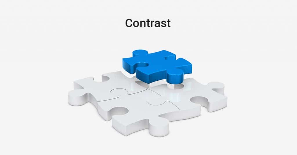
You can add contrast with:
- Colours
- Shapes
- Sizes
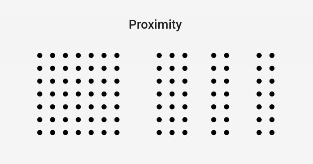
Proximity
If you wish to create a sense of organization in your design, proximity is the fundamental aspect. You need a decluttered and clean design, and for it, you need to group similar and relatable elements.
Put the principle of proximity to use by grouping similar elements to make it look like one unit. The easy way is to place the objects near each other physically. Another way is to connect them visually by placing similar fonts, sizes and colours together.
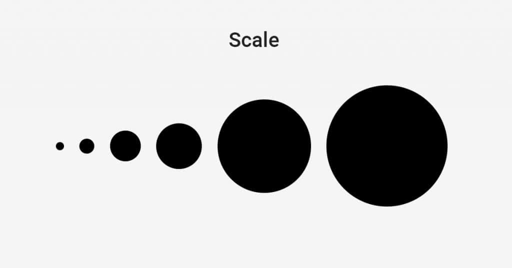
Scale
The deliberate sizing of different elements in a design is known as scale. The scaling technique brings specific elements into your audience’s focus and lets your user make sense of the concept you are putting forward.
You can use increased font size or place an image in your design to take your users through the process of perceiving your final message.
Repetition
The use of the principle of repetition can drastically enhance your graphic designs for social media marketing. Repetition plays a crucial role in designing; it helps to strengthen and establish various elements.
You can also call it “consistent branding.”
While you design your posts, remember the three things you can not break your consistency with – fonts, logos and colours. When you continue to maintain consistency, your brand will gain a unique and recognizable look over a while.
Check out this image by Microsoft.
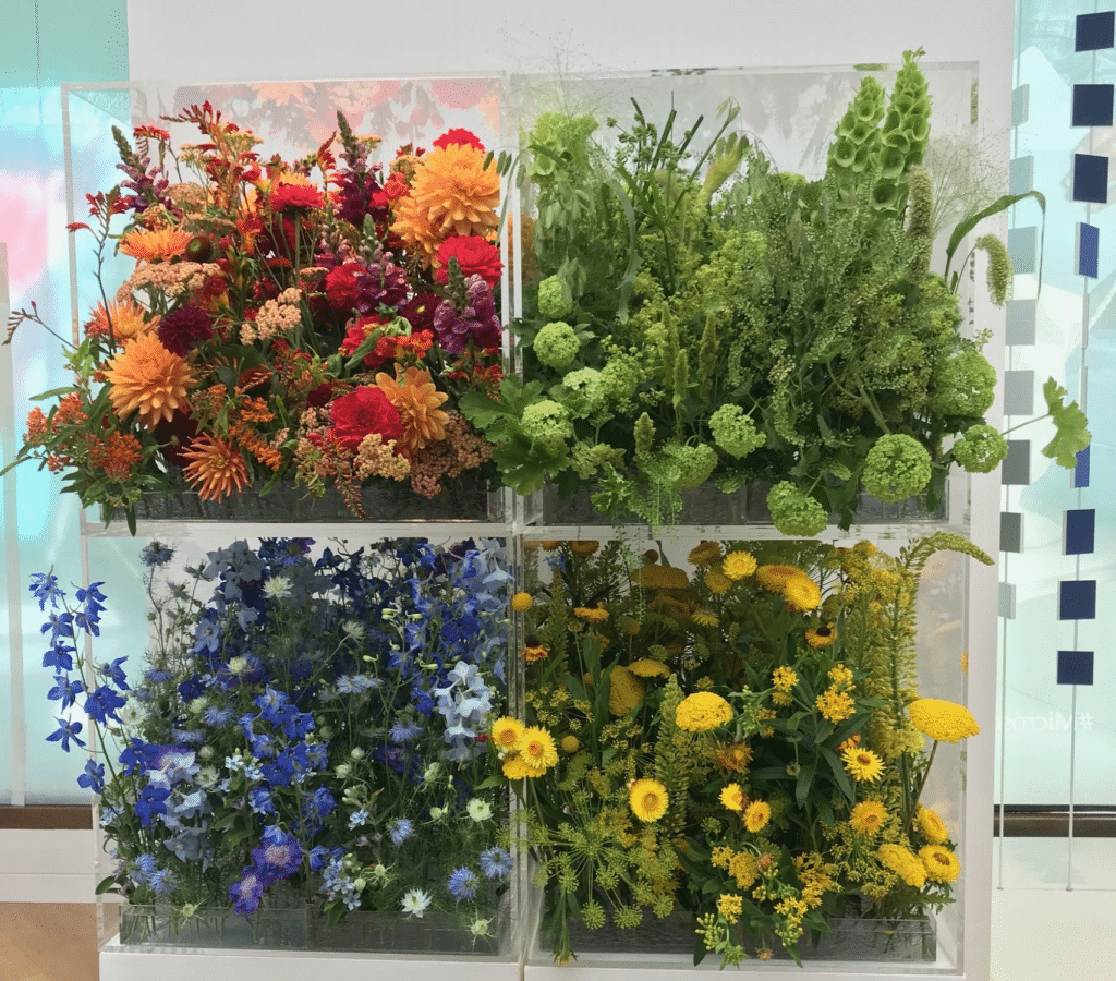
The company has intelligently used the same colours of their logos in the image of nature. It makes people remember the brand (thanks to the consistent colours of the logo) and promotes their message to go greener.
It is a perfect message delivered in the most unique yet straightforward visual way.
Hierarchy
We are sure you must be working with many different elements in your social media designs. And each element plays an imperative role in delivering the final message.
So how do you place them, so every element does its job and takes your user through the story journey?
You use the concept of hierarchy! It is one of the most effective social media tricks to ensure your message is clearly delivered.
Take advantage of the tactic by starting with fully understanding your goal. Place your most vital message at the focal point, and then use the other design principles to make it outshine and visible.
In simpler words, place the most crucial elements in the largest font.
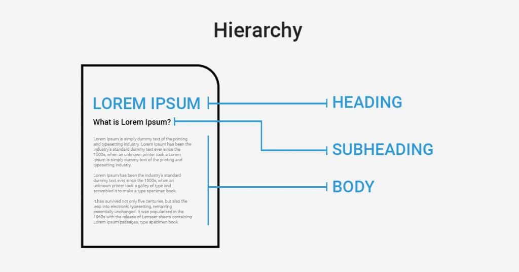
Once it is done, you can start building your next critical piece of information without hampering the rest of the elements.
Space
What you choose to exclude from your images is as important as the elements you include. This is why the value of white space in designing is paramount. White space refers to the area that surrounds the elements you put in your design.
Simplicity is the new fancy. Thus you should never underestimate its power. A perfectly balanced space can add an aesthetic value to your design while enhancing user attention to the crucial elements of your image.
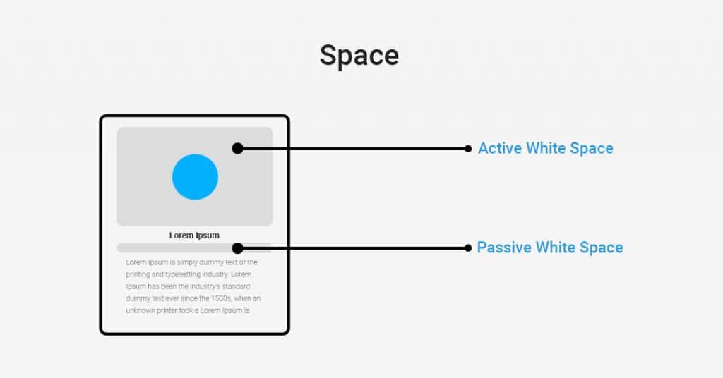
Pro design tip:
While you add shapes, fonts and colours to your design, notice the shapes and outlines forming around them. Once you properly understand them, use the area to your advantage to enhance the visibility of your focal elements.
Direction
To fully leverage your social network designs, you must understand how the human eye functions. The way a human analyzes an image, design, website or any other visual element is often unique but consistent.
Therefore, you must know the technique of guiding your audience along the path you desire and create a deliberate “flow.”
To create an outstanding design, we should understand how users perceive or view a website they see for the very first time.
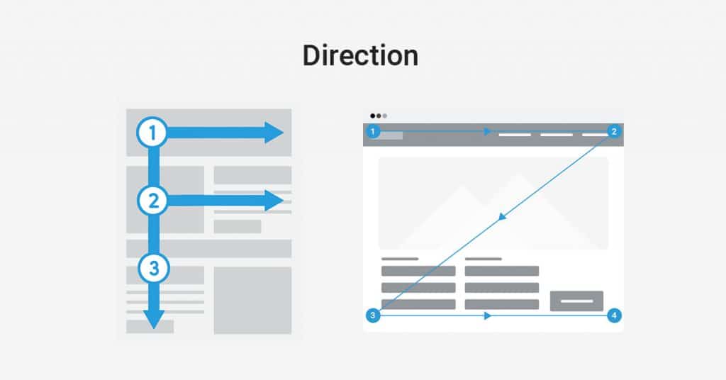
People often view a website in an “E”, “F” and sometimes “Z” pattern. So placing the crucial elements of your design on the left or the upper left side will do wonders for your social media.
Shape
A shape refers to two-dimensional areas that have a recognizable boundary. Shapes include triangles, squares, circles, etc.
You can segregate the shapes into two types, geometric and organic (they are more in an accessible form).
You can communicate via your image, thanks to the shapes. It gives your pictures an entity. We essentially understand street signs, abstract art and various symbols via shapes.
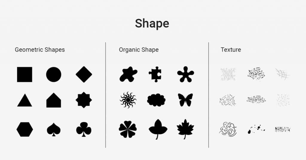
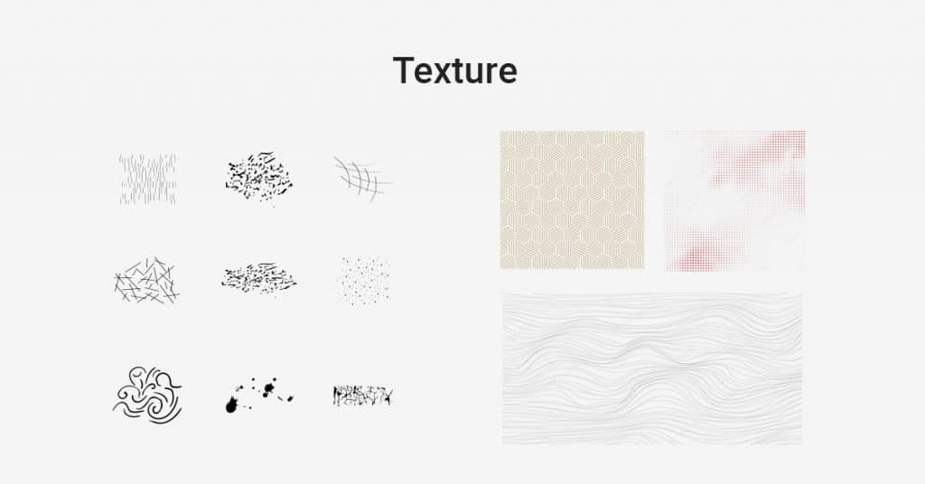
Texture
Texture refers to the physical quality of a subject. You can create images in 2D or 3D, and the look and feel of it will largely depend on the texture you provide. You can either make an image that has a set texture or design illustrations that suggest a specific subject will have texture if it existed in real life.
In designs, texture adds depth. You can design an image to look soft, hard, smooth, rough, bumpy, etc. it all depends on the texture you give it.
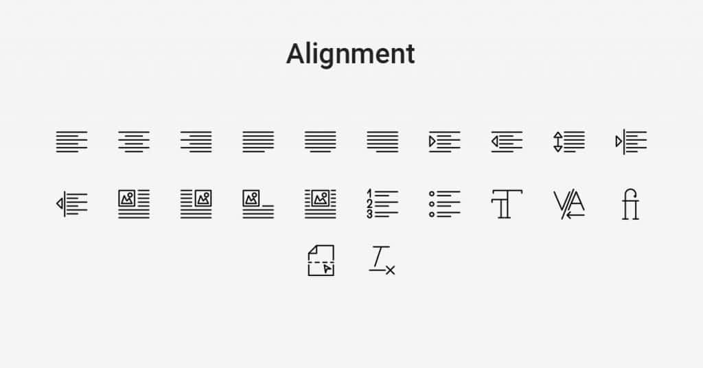
Alignment
Lining up your text in the design is of utter importance. The alignment design refers to line up the text and graphics in a design correctly.
You might never notice when your elements are aligned in a design, but when you aren’t, it will bother you. A design that does not have proper alignment will end up looking cluttered and unfinished.
However, when you align the elements in your image, they will organize your design and make it more readable.
Conclusion:
All the 11 elements mentioned in this write-up play a crucial role in designing the perfect graphics for your social media. A design will consist of all these elements; harmonizing and balancing between every element is a great designer’s trait.
Although every element can individually hold a particular emotion and message, these elements together can deliver an aesthetic value while clearly showcasing your message. All you have to do is create harmony, remember the ethics and don’t go too much or too little with anything.
As long as you keep it simple, charming and readable (by keeping in mind the rules), you are good to go!